
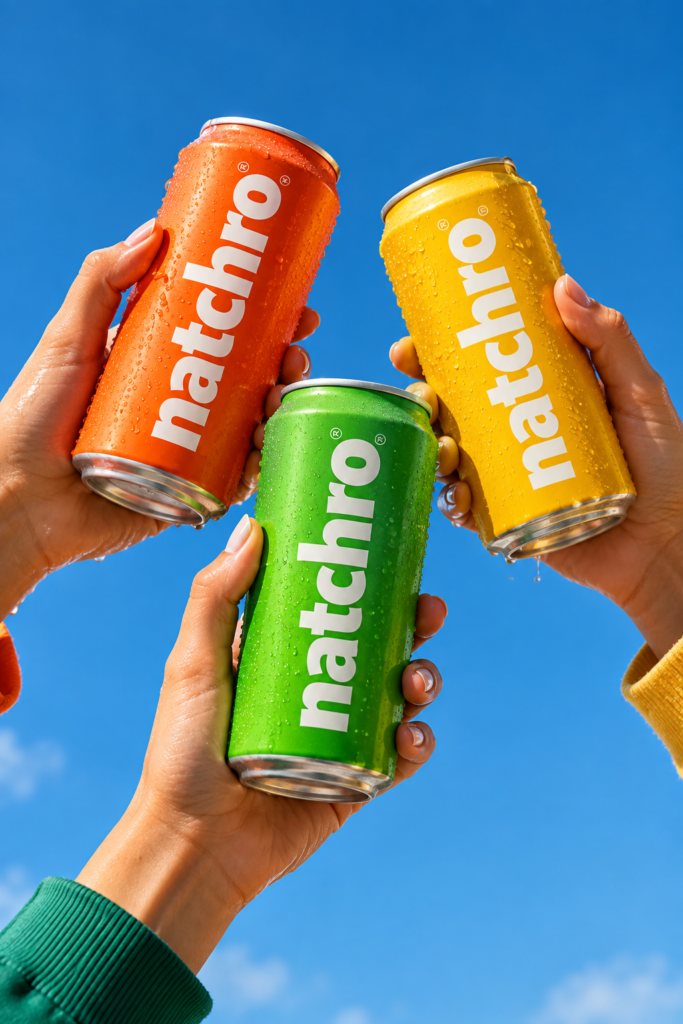
A successful juice brand NATCHRO is more than a logo on a bottle-it is a complete visual experience that communicates freshness, flavor, and quality. This label design project explores a modern and vibrant approach to beverage branding, creating packaging that feels refreshing, energetic, and instantly recognizable.
Design concept
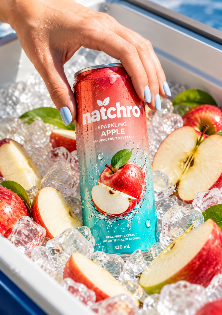
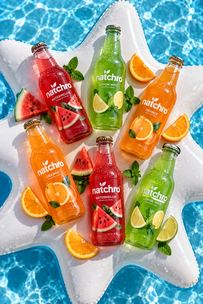
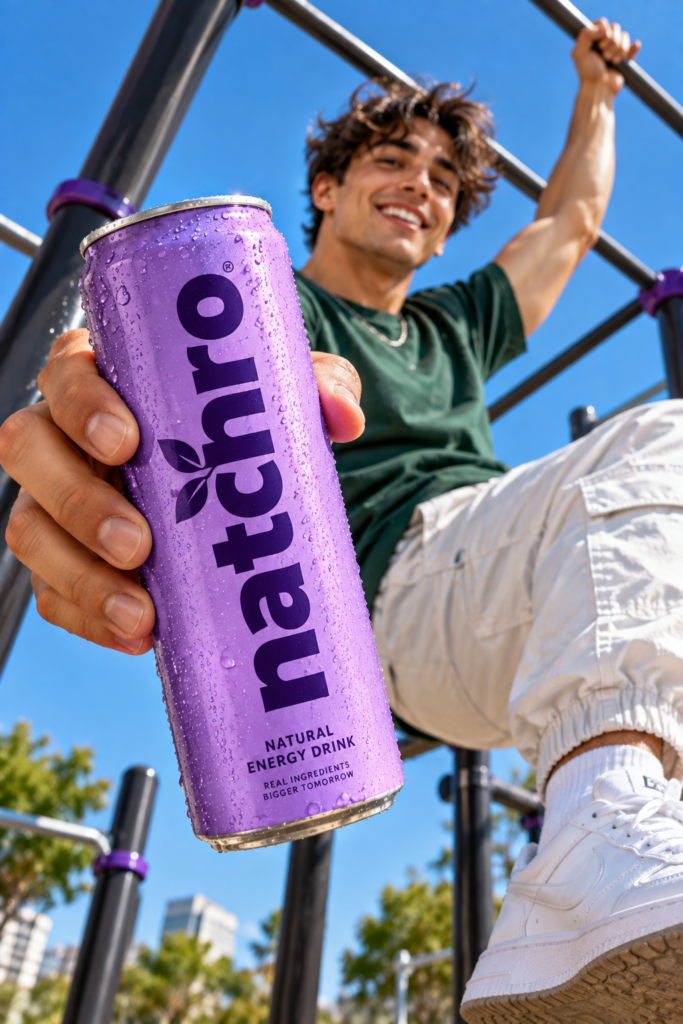
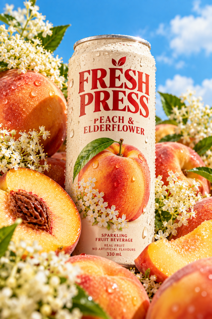
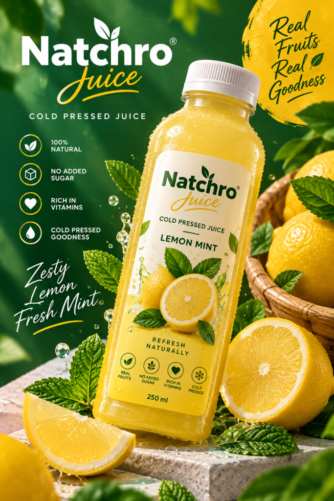
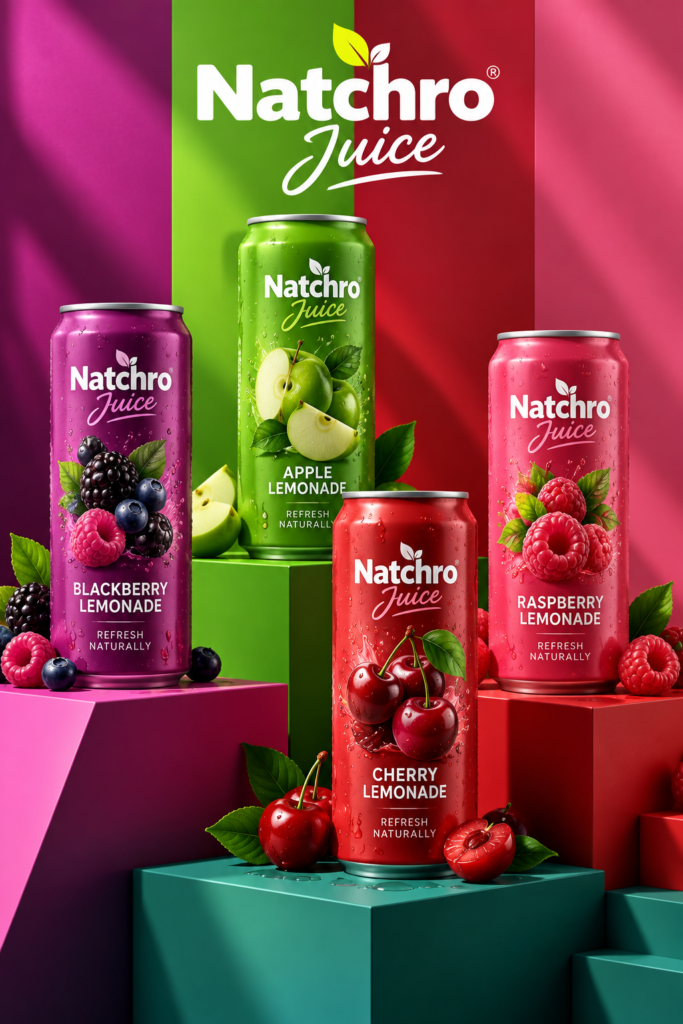
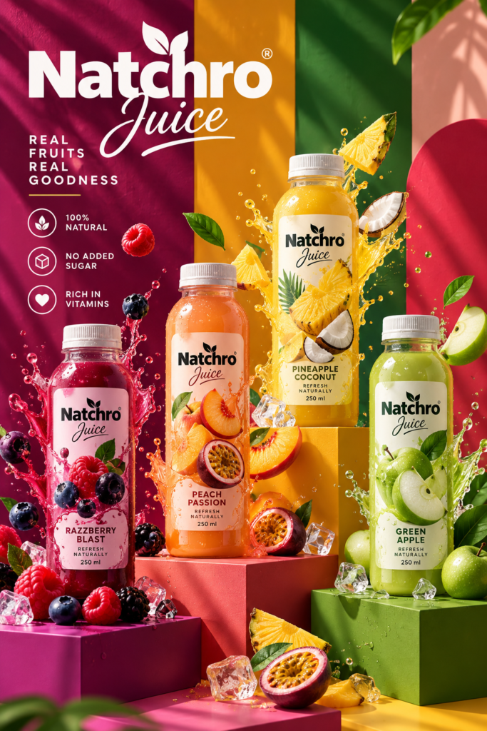
The main idea was to build a clean visual identity inspired by fresh fruits and natural ingredients. Bright colors, bold typography, realistic fruit elements, and minimal layouts work together to give the packaging a contemporary appearance while keeping the product easy to understand.
Flavor-Based Identity
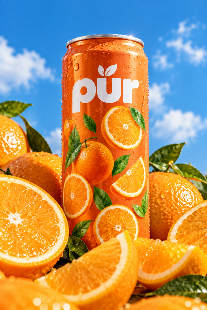
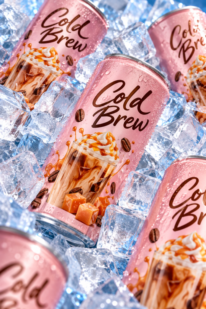
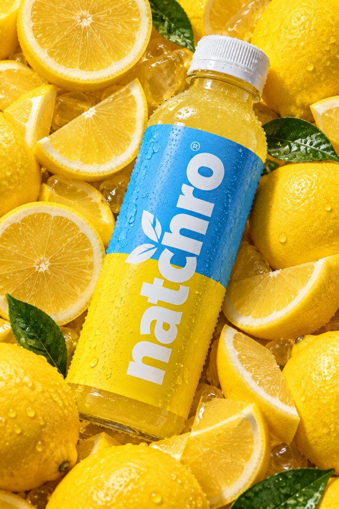
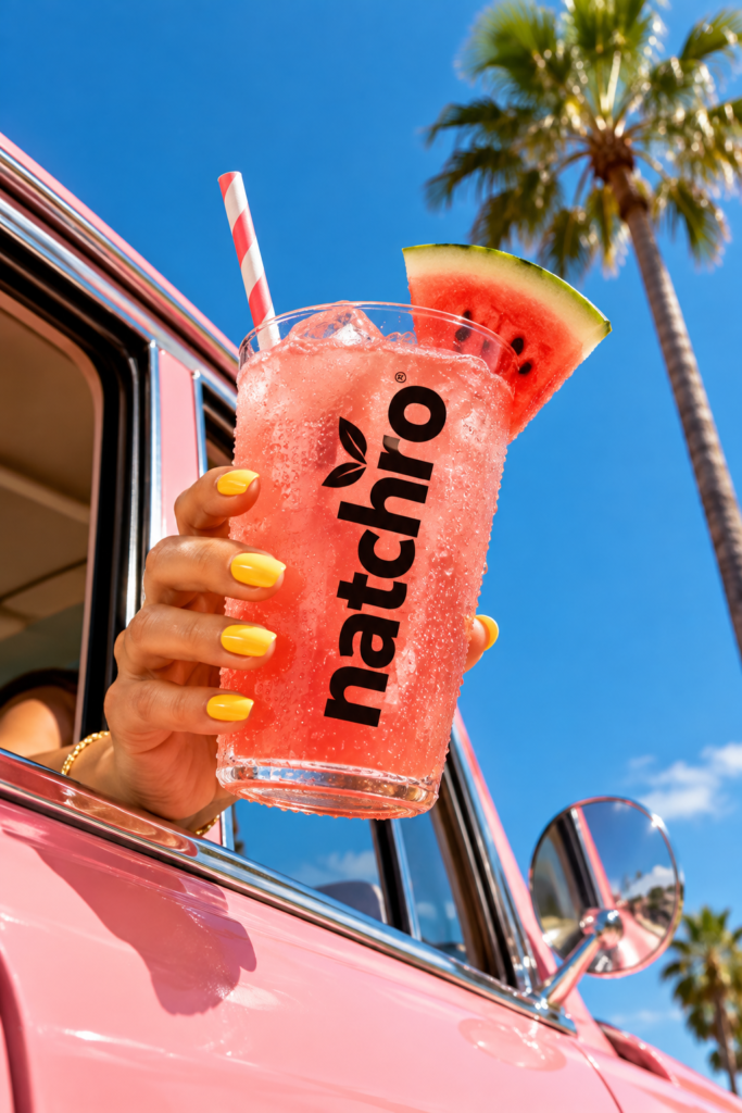
each juice flavor has its own distinctive color palette and fruit imagery. Orange, watermelon, apple, lemon, peach, berries, and tropical fruits create a colorful family of products while maintaining a consistent overall brand language.
Label & Packaging
The labels balance strong branding with clear product information. Large typography creates visibility, while fruit illustrations and carefully selected colors immediately communicate the flavor. Simple supporting graphics help maintain a modern and premium appearance without making the packaging feel overcrowded.