Showcase your web design projects in a polished and professional way with this Responsive Website Mockup Presentation designed to display your layouts seamlessly across multiple devices. This mockup features realistic screens for desktop or laptop tablet and smartphone allowing you to demonstrate how your website adapts beautifully to different screen sizes. The clean modern layout keeps the focus on your design while clearly communicating responsiveness usability and attention to detail.
This mockup is perfect for portfolios client presentations case studies and marketing visuals helping viewers instantly understand how your website performs across devices. By presenting your design in a unified multi device setup you can highlight consistency layout flexibility and user experience in a way that static screenshots cannot achieve.
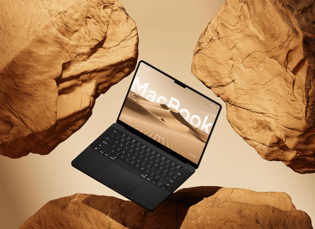
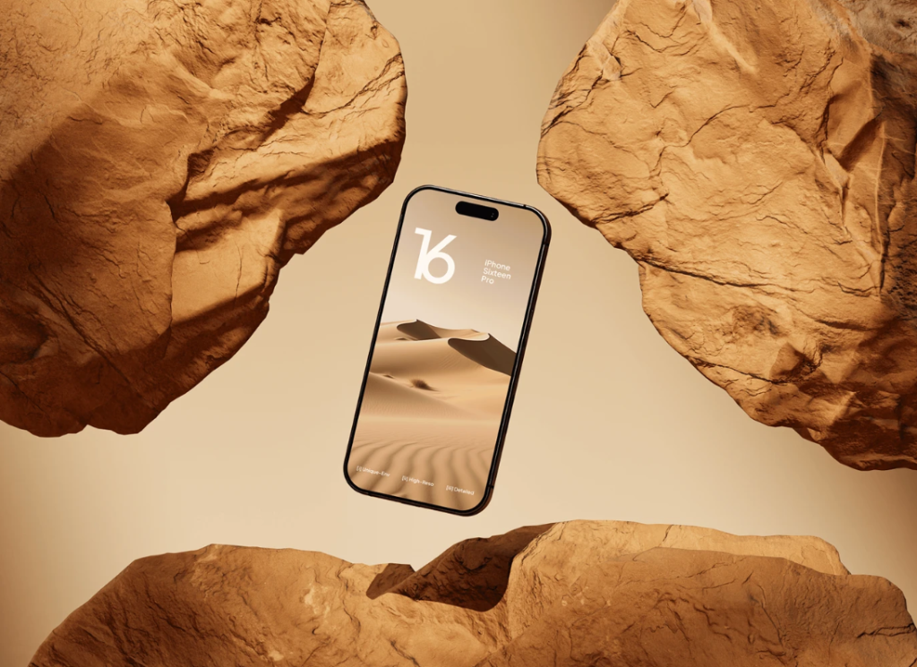
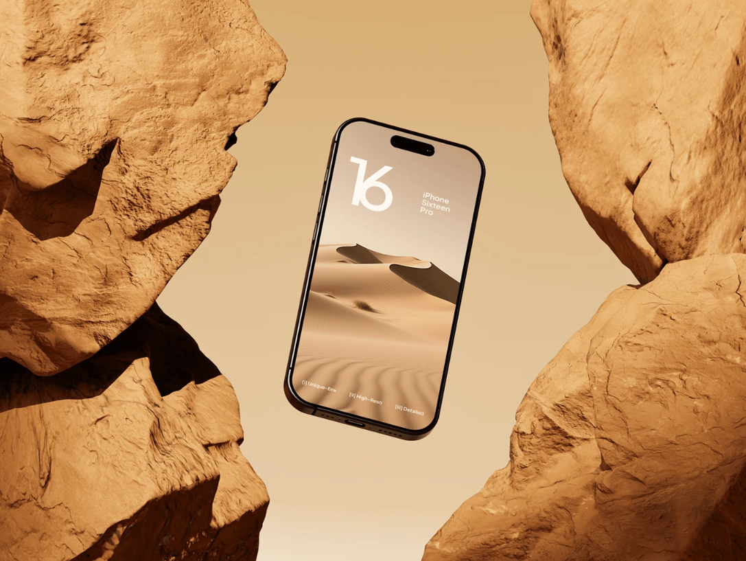
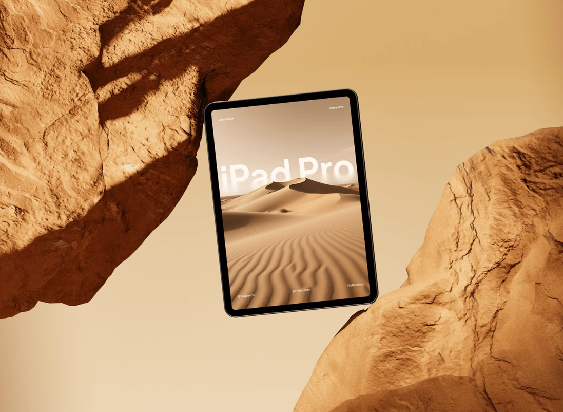

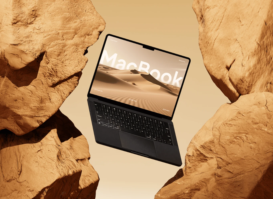
The file is delivered in a high resolution fully layered PSD format and includes smart object layers for easy customization. You can quickly insert your website screens by replacing the smart objects saving time and ensuring perfect alignment on each device. In addition the mockup allows you to adjust shadows reflections and background tones giving you full control to match your brand identity or project style.
With its sharp resolution and realistic detailing this mockup ensures your website looks crisp and professional across all formats. It is an ideal tool for web designers digital agencies developers and freelancers who want to present their work clearly professionally and with strong visual impact. Whether youre pitching to a client or updating your portfolio this responsive website mockup helps your designs stand out with clarity and confidence.